
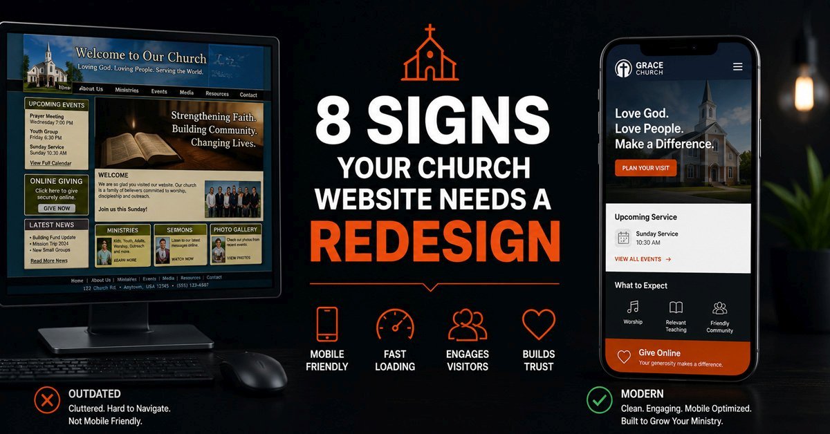
Your church website needs a redesign when it no longer serves the people it is supposed to serve. That sounds obvious, but most churches do not make the decision based on clear evidence. They make it based on a vague feeling that the site looks a bit dated, or they wait until something breaks badly enough to force the issue. Both of those timelines are too late. The signs appear well before the site looks visibly old, and the cost of delay is real: visitors who cannot find service times, online giving that does not work on mobile, and a first impression that does not match the quality of the ministry behind it.
At Sentinel Infotech, a meaningful share of our church website work involves sites that were not broken in any obvious technical sense. They were simply no longer doing the job. Services had changed, the congregation had grown, new ministries had launched, and the website had stayed the same. The gap between what the site said and what the church actually was had become large enough that it was working against the ministry rather than for it.
What follows are the signs we look for when a church asks us to assess whether their current site is worth maintaining or whether a redesign is the right call. Some of these are immediate, some accumulate slowly. All of them are worth understanding before making the decision either way.
Why Churches Wait Too Long to Redesign
Church budgets are built around mission, not infrastructure. Every dollar spent on a website redesign is a dollar that could have gone to outreach, staff, facility maintenance, or community programs. That is not a wrong instinct. It is actually a healthy one. The problem is that it leads churches to treat their website as a cost to minimize rather than a tool that either earns its keep or quietly drains the ministry's potential.
A church website that turns away a first-time visitor has a cost. A giving page that does not work on a phone has a cost. A sermon archive that loads slowly and cannot be searched has a cost. These costs are invisible on a budget sheet because nobody writes a line item for "website holding us back." But they are real, and they compound over time exactly the way a well-built site compounds in the opposite direction.
The other reason churches wait is that the person who remembers how the current site looked when it launched is still the person evaluating it. Familiarity makes things invisible. A volunteer who has looked at the same homepage for four years does not see what a first-time visitor sees. They see what they remember the site being when it launched, which felt good at the time.
The 8 Signs It Is Time for a Church Website Redesign
A first-time visitor to your church website is not browsing. They are looking for a specific answer to a specific question: when are services, where is the building, and what will it feel like when I walk in. They will spend less than a minute on the homepage before deciding whether to continue or leave. If those three things are not immediately clear, the website has already failed the most important job it has.
This sounds like a low bar, but it is consistently where churches fall down. Service times buried in a footer, a location visible only on the contact page, and a "What to Expect" section accessible only through a drop-down menu are all common patterns on church sites that feel fine to the people managing them and are genuinely confusing to someone who has never been before. Pull up your homepage on your phone and time how long it takes to find your service times without already knowing where they are.
The majority of people who visit a church website for the first time do so on a phone, often because they found the church through a Google search or a social media recommendation. A site that was built for a desktop screen in 2018 and never properly adapted for mobile is showing that first-time visitor a broken experience: text they have to pinch-zoom to read, navigation that requires precise tapping on small links, and forms that are painful to complete on a phone keyboard.
Mobile issues go beyond cosmetics. A giving form that is not optimized for mobile means donors who try to give on their phone are dropping off before the donation completes. An event registration form that requires horizontal scrolling on a phone loses sign-ups. These are direct, measurable costs. The test is straightforward: open every main page of your site on your actual phone, not in a browser preview, and complete the key actions a visitor would take. If anything feels difficult, it is actively costing you.
This is the one sign that overrides every other consideration. If your online giving is not working well, the redesign pays for itself. A giving page that loads slowly, requires creating an account before donating, does not work on mobile, or lacks recurring donation options is not just inconvenient. It is directly reducing the generosity of your congregation by adding friction at the moment of decision.
We have worked with churches where a significant portion of their congregation wanted to give online but found the process frustrating enough that they reverted to cash or checks. The issue was rarely the congregation's willingness to give. It was a giving system built years ago that had not kept pace with what donors now expect from any online transaction. Modern giving integrations with Stripe or similar processors, proper fund designation so donors can specify where their gift goes, and a clean mobile experience typically produce a meaningful increase in online giving frequency and total volume within the first month after launch.
If your current giving page is more than three years old and has not been specifically tested and updated for mobile, assume it is losing donations and let that assumption drive the timeline for your redesign.
A church that preaches weekly builds a significant archive of content over time. That archive is genuinely valuable to your congregation and to people exploring your ministry from outside. A sermon someone heard three months ago that they want to share with a family member. A series on a topic that is relevant to something someone is going through right now. A speaker they want to listen to again. If your archive requires scrolling through a reverse-chronological list of posts to find any of those things, the content is there but functionally inaccessible.
A well-built sermon archive uses a custom content type with filtering by series, speaker, topic, date, and scripture reference. It loads quickly even with hundreds of entries. It has a search function that returns relevant results. Most church sites built on generic WordPress themes use blog posts for sermons, which works adequately for the first year or two and becomes increasingly difficult to navigate as the archive grows. If your congregation cannot realistically find a sermon from eighteen months ago without knowing the exact date it was preached, your archive needs to be rebuilt as part of a redesign.
This one is more common than any church administrator wants to admit. A staff page with photos of people who left two years ago. A ministries section listing programs that were discontinued during the pandemic and never removed. A "coming soon" event for something that happened in 2023. A mission statement that was updated in a board meeting but never made it to the website.
Outdated content is not just an accuracy problem. It is a trust problem. A first-time visitor who finds a staff page with an unfamiliar face listed as senior pastor, or a ministry they tried to contact that no longer exists, reasonably questions how attentive this church is to the details that matter. And if the small details on the website are wrong, what does that suggest about the organization behind it? A redesign that starts with a complete content audit often surfaces years of accumulated drift between what the church is and what the website says it is.
A church website that takes five seconds to load on a mobile connection is losing a measurable share of visitors who do not stay to find out what the site says. Page speed is not a technical vanity metric. It is a direct factor in whether the people you are trying to reach actually see your content. Google also factors page speed into local search rankings, which means a slow church website is harder to find in search and harder to stay on once someone arrives.
The causes of a slow church website are almost always accumulated technical debt: unoptimized images uploaded at full resolution, a theme built years ago that carries unnecessary code weight, too many plugins each adding their own scripts to every page load, and a hosting configuration that was adequate when the site launched but has not been updated since. These problems cannot be solved with a plugin. They require a rebuild with performance as a consideration from the start, not an afterthought. Our post on WordPress technical SEO fixes covers many of the specific performance issues that affect church websites built on outdated foundations.
A church website that only gets updated when a developer is available is not a functioning communication tool. It is a static document that gradually becomes less accurate. If your office administrator, media volunteer, or events coordinator cannot independently update service times, publish a new sermon, or add an event without calling someone, the website is already failing as a ministry tool regardless of how it looks.
This situation usually happens when a site was built by a developer who made technically sound decisions that did not account for who would actually be maintaining the site. A custom theme with no visual editor. A sermon archive that requires editing custom fields that are not labeled clearly. An events calendar with a configuration that makes recurring events difficult to manage. The technical debt is invisible until the person trying to make a basic update cannot figure out how, and the site falls behind as a result. A redesign that puts content management at the center of the architecture, building for the volunteer who will be using it two years from now, is what actually makes a church website function as a long-term communication asset.
A church website that processes online giving holds financial data that needs to be protected. A site that has not been kept updated is a target. Outdated plugins are the most common attack vector for WordPress sites, and a church website that has been running for several years without consistent maintenance almost certainly has plugins that have not been updated in months, some of which have known vulnerabilities that malicious actors actively scan for.
A site that has already been compromised, even once, and was cleaned and patched rather than rebuilt, is a site with residual risk. Malware cleanup restores function but rarely addresses the root cause with the same thoroughness as starting fresh. If your site has had a security incident, if your SSL certificate has expired and been renewed reactively, or if your plugin list includes things that have not been updated in over a year, the security posture of the site is a legitimate reason to treat the redesign as urgent rather than optional. Our post on what actually gets WordPress sites hacked covers the specific vulnerabilities that affect sites in exactly this situation.
Redesign vs Refresh: How to Tell the Difference
Not every church website problem requires a full redesign. Some situations are fixed by a refresh: targeted updates to specific pages, a new theme applied to existing content, or fixing specific broken elements without rebuilding the underlying architecture. Knowing the difference before committing to a full project saves time and budget.
The question that separates a redesign from a refresh is whether the problem is cosmetic or structural. A cosmetic problem is one that can be solved by changing how the site looks without changing how it is built. A structural problem requires changing the architecture because the current build is incompatible with what the site needs to do.
| Situation | A Refresh May Be Enough | A Redesign Is Likely Needed |
|---|---|---|
| Visual appearance | Site looks dated but all functionality works correctly and content is accurate | Site looks dated AND the underlying theme or builder creates performance problems |
| Mobile experience | Minor layout issues on specific pages that can be fixed with targeted CSS | Site was built for desktop and is not genuinely responsive at a structural level |
| Sermon archive | Archive works but needs reorganization and better filtering | Sermons are blog posts with no custom fields, making filtering impossible without a rebuild |
| Online giving | Giving platform still supported and functional, needs visual update | Giving system is deprecated, unsupported, or fundamentally broken on mobile |
| Content management | Admin interface is manageable, specific sections need clearer labeling | Non-technical staff cannot update the site at all without developer help |
| Page speed | Speed is acceptable, specific heavy pages need image optimization | Core Web Vitals consistently poor across the site due to theme or plugin architecture |
| Security posture | All plugins current, no previous compromise, SSL current | Site has been compromised, has significantly outdated core dependencies, or has never been properly maintained |
| Content accuracy | A few pages need updating, overall structure reflects the church accurately | A large share of content is outdated and the site does not reflect the church's current reality |
In practice, most churches that are asking whether they need a redesign need one. The fact that the question is being asked seriously usually means the accumulated signs have crossed a threshold that a refresh cannot fully address. But the table above gives you a structured way to evaluate specific elements rather than making the decision based on overall impression alone.
What the Redesign Process Actually Looks Like for a Church
A church website redesign is not a cosmetic project. The visual outcome matters, but the decisions that determine whether the site actually serves the congregation happen before any design work begins. Content mapping, giving system planning, sermon archive architecture, user role configuration, and mobile workflow testing are all decisions made during the planning phase that determine whether the result is a site that works or a site that looks good at launch and creates problems six months later.
The planning conversations we have with church clients before starting a redesign focus on a few specific questions. Who will be managing each section of the site after launch, and what are their actual technical capabilities? What does a typical Sunday morning workflow look like, and what does the site need to handle automatically versus manually? What giving platform is in place, and what does the finance team actually need from the reporting side? Which ministries are stable and which are likely to change over the next two years?
These questions shape every architectural decision in the build. A church that has a dedicated media team can accommodate a more detailed sermon publishing workflow. A church run by a small staff and volunteers needs an interface that requires almost no training to use. Getting the answers right before writing a line of code is what separates a redesign that serves the church for five years from one that needs to be redone in two.
Our guide to what church and ministry websites actually need covers the specific features and architectural decisions in detail. And our church and nonprofit web development service page explains how we approach the full process from initial assessment through launch and ongoing maintenance.
Use Cases: What This Looks Like in Practice
When a Redesign Is Not the Right Answer Yet
Being honest about this matters. Not every church with an imperfect website needs a redesign right now. If your site was built within the last two years by a capable developer, loads quickly, processes giving reliably on mobile, and can be updated by your staff without developer help, you likely need maintenance and content discipline more than you need a rebuild. A structured WordPress maintenance plan and a consistent content review schedule will serve you better than a premature redesign.
Similarly, if your congregation is very small and your needs are genuinely minimal, a simple refresh of your current site's most important pages may achieve everything a full redesign would at a fraction of the cost. The goal is a site that serves your congregation, not a site that impresses the committee evaluating it. Sometimes those are the same thing. Sometimes they are not.
The clearest sign that you need a redesign rather than maintenance or a refresh is when the structural decisions made during the original build are incompatible with what you need the site to do now. You cannot add a proper sermon archive to a site built to store sermons as blog posts. You cannot make a non-responsive site genuinely mobile-friendly without a rebuild. You cannot secure a site against modern attack vectors if its core dependencies are years out of date. When the root cause of the problem is architectural, the only real solution is architectural.
Frequently Asked Questions
How often should a church website be redesigned?
There is no fixed schedule that applies to every church. A well-built site that is actively maintained, kept updated, and has content managed consistently can serve a church for five to seven years before a full redesign is warranted. The signs in this post matter more than any calendar. A site that still serves its congregation accurately, loads quickly, processes giving reliably, and can be updated by non-technical staff does not need to be rebuilt simply because it has been live for four years. The decision should be driven by whether the site is still doing its job, not by how long it has been live.
Can we update our existing site ourselves instead of hiring a developer?
It depends entirely on what needs to change. Content updates, adding new pages, uploading sermons, and managing events are all things a non-technical volunteer can do on a well-built WordPress site without any developer involvement. Structural changes, such as adding a proper sermon archive, replacing a giving system, or fixing genuine mobile responsiveness problems, are not things that can be done without developer work. The distinction is between updating content within an existing structure versus changing the structure itself. If the problems you are trying to solve are structural, attempting to fix them without a developer typically produces a worse outcome than either living with the current site or doing a proper redesign.
What should we do to prepare before contacting a developer about a redesign?
The most useful preparation is a clear picture of who will manage the site after launch and what they need to be able to do without developer help. Write down the specific tasks that need to happen weekly: uploading sermons, updating event listings, managing giving, publishing announcements. Then note which of those tasks your current site handles well and which it handles poorly. That list becomes the basis for a scope conversation that produces an accurate project estimate. Church websites that run over budget or under-deliver almost always do so because the scope conversation happened around design preferences rather than operational requirements. Knowing what the site needs to do, and who needs to do it, before the first developer conversation makes every subsequent step faster and less expensive. Our post on what to look for in a WordPress developer for churches covers the questions worth asking before signing with anyone.