[vc_column_inner width=”1/1″]
 [/vc_column_inner]
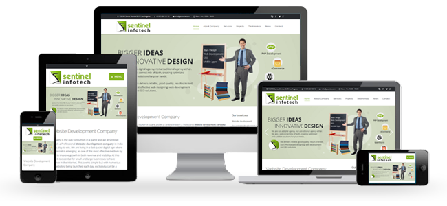
Cross -Platform Compatibility is the term, which differentiates a responsive website design from a regular website design. Responsive web design employs fluid layouts, which offer a shapable viewing experience to your content across various platforms. At Sentinel Infotech, we employ best usability practices to make your website content responsive across mobile devices and other technology platforms.
Responsive web development is a term for future friendly website development because huge expectations are pinned on a website to perform across different platforms, devices and browsers. A research says that more than 80% people in USA, UK, and several other developing as well developed countries around the world are relying on mobiles and tablets to access internet. This means, by having a plain old desktop website, you are losing on 80% consumers who would have contributed to your business.
By now many businesses understand that it is important to keep mobile users engaged with their website. Aggregating results from Forrester Research and Equation Research, 50% of the mobile users are unlikely to visit a website, if it fails to load properly over a mobile or tablet within 2-3 seconds and 30% avoid buying from such website across other channels. Perhaps you cannot afford to take such a big risk of missing 80% customers due to a poorly behaving website, isn’t it? This means it is a high time you should seriously start thinking about a responsive webpage.
A mobile friendly website boils down a number of issues that arise from bad accessibility. Responsive web design eliminates the need to manage separate website for mobile and other platforms.
A Responsive web design focuses on three aspects-
-
Flexible images
-
Flexible Media queries
-
Flexible grid-based layouts, which you can resize images in a variety of mobile platforms
At Sentinel Infotech, our team has all the technical knowledge, tools and experience to meet your requirements of a responsive website.
Now you may ask what is so special about responsive web design company Sentinel Infotech. Here is what we will be different-
[vc_column_inner width=”1/2″]
-

Strategizing
We realize that every website is different and their needs are different too. We develop customized strategies for each client understanding of their web site and its requirements.
-

Branding
We employ our technologies and communication strategies to help your brand to the next level. We can create cross-platform friendly website for you or your existing website to respond to the infusion of the necessary elements, depending on the choice.
[/vc_column_inner][vc_column_inner width=”1/2″]
-

Creating Enriched User Experience
We strive to develop websites that offer rich user experiences with fast loading and easy to navigate.
-

Complete customer satisfaction
For us business relationship begins from the moment the client requests for a quote by mail or at our phone numbers. We work closely with our customers to understand their needs and develop strategies which help enhance their brand experience.
[/vc_column_inner]
Sentinel Infotech is perhaps one of the fastest growing responsive web design company India, which offers future friendly web design services at extremely affordable pricing. Please contact us at info@sentinelinfotech.com to know more about it.